

代码拉取完成,页面将自动刷新
高拓展高自定义性ActionBar,完美替代Android系统默认。
第一,先说说官方的。官方的在不同系统上的风格并不统一,自定义项太少,不能满足开发需求,所以才涌现了这么多的开源项目。
第二,网上开源的。网上的已有的,我发现的,用过的大部分都是直接封装一个固定样式的布局,或控制控件的显示隐藏,或动态添加需要的控件。但也仅限于自定义左右图标的和中间标题的个数和样式。如果要自定义ActionBar的背景呢?要让背景显示一个图片呢?要让图片延伸到状态栏下面呢?要让背景实现半透明高斯模糊效果呢?要限定按钮图标的大小呢?要自定义中间标题的背景呢?要显示一个搜索框呢?要让搜索框带有清空和搜索图标呢?要自定义搜索框样式呢?要在网络请求时显示一个Loading效果呢?等等这些需求都是无法满足的。而且我相信这样的需求不在少数。
也可能有可以实现的框架,只是我还没发现。
要说这个绝对可以实现,肯定是不可能的,但我相信可以实现市面上99%以上的需求。
哪里来的这么大的自信?还是先看看整个项目的层级结构吧。
整个ActionBarEx分为3个基本层级,具体负责功能和命名约定如下:
| 根层级 | 子层级 | 说明 | 备注 |
|---|---|---|---|
| BackgroundLayer | 背景层 | 可自定义布局 | |
| ActionBarLayer | 主体层 | 垂直线性布局 | |
| StatusBar | 状态栏 | ||
| TitleBar | 标题栏 | 可自定义布局 | |
| BottomLine | 分割线 | ||
| ForegroundLayer | 前景层 | 可自定义布局 |


别急呀,我再说说实现细节。
好好,别动手,有话好好说,你把这个规则长方体放下。。。
要说使用方式,还得再明确几个类
allprojects {
	repositories {
		...
		maven { url 'https://www.jitpack.io' }
	}
}
最新版本是多少,看下Releases
从2.2.9以后版本去除版本号前的v,引用时需要注意下。
从3.0.0版本开始分离了ActionBarEx和ActionBarCommon/Search。
从3.1.0版本新增ActionBarSuper
dependencies {
	// 完全引入
	implementation 'com.github.goweii:ActionBarEx:3.2.2'

	// 只引入ActionBarEx
	implementation 'com.github.goweii.ActionBarEx:actionbarex:3.2.2'
	// 引入ActionBarCommon/Search/Super,依赖于ActionBarEx
	implementation 'com.github.goweii.ActionBarEx:actionbarex-common:3.2.2'
}
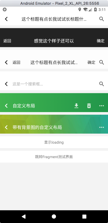
这里用ActionBarCommon举个例子
<per.goweii.actionbarex.common.ActionBarCommon
    android:id="@+id/simple_action_bar_3"
    android:layout_width="match_parent"
    android:layout_height="wrap_content"
    android:layout_marginTop="10dp"
    android:background="#ccffffff"
    app:ab_autoImmersion="false"
    app:ab_bottomLineColor="@color/line"
    app:ab_bottomLineHeight="0dp"
    app:ab_foregroundLayerLayout="@layout/loading_bar"
    app:ab_statusBarColor="@color/transparent"
    app:ab_statusBarMode="dark"
    app:ab_statusBarVisible="false"
    app:ab_titleBarHeight="48dp"
    app:abc_leftIconColor="@color/black"
    app:abc_leftIconRes="@mipmap/back"
    app:abc_leftText="返回"
	app:abc_leftTextPaddingLeft="0dp"
	app:abc_leftTextPaddingRight="0dp"
	app:abc_rightIconColor="@color/black"
	app:abc_rightIconRes="@mipmap/search"
	app:abc_rightText="确定"
    app:abc_rightTextPaddingLeft="0dp"
    app:abc_rightTextPaddingRight="0dp"
    app:abc_titleText="这个标题有点长我试试长标题什么样子"
	app:abc_titleTextMaxWidth="180dp" />
actionBarCommon.setOnLeftIconClickListener(new OnActionBarChildClickListener() {
    @Override
    public void onClick() {
    	Toast.makeText(context, "onLeftIconClick", Toast.LENGTH_SHORT).show()
    }
});
使用起来是这个样子的
<?xml version="1.0" encoding="utf-8"?>
<RelativeLayout xmlns:android="http://schemas.android.com/apk/res/android"
    android:layout_width="match_parent"
    android:layout_height="48dp">

    <LinearLayout
        android:layout_width="match_parent"
        android:layout_height="match_parent"
        android:orientation="horizontal">

        <ImageView
            android:id="@+id/iv_back"
            android:layout_width="48dp"
            android:layout_height="48dp"
            android:padding="15dp"
            android:scaleType="fitCenter"
            android:src="@mipmap/back" />

        <TextView
            android:layout_width="wrap_content"
            android:layout_height="match_parent"
            android:gravity="center"
            android:text="自定义布局"
            android:textColor="@color/white"
            android:textSize="17sp" />

    </LinearLayout>

    <LinearLayout
        android:layout_width="match_parent"
        android:layout_height="match_parent"
        android:gravity="right"
        android:orientation="horizontal">

        <ImageView
            android:layout_width="48dp"
            android:layout_height="48dp"
            android:padding="15dp"
            android:scaleType="fitCenter"
            android:src="@mipmap/download" />

        <ImageView
            android:layout_width="48dp"
            android:layout_height="48dp"
            android:padding="15dp"
            android:scaleType="fitCenter"
            android:src="@mipmap/delete" />

        <ImageView
            android:layout_width="48dp"
            android:layout_height="48dp"
            android:padding="15dp"
            android:scaleType="fitCenter"
            android:src="@mipmap/more" />

    </LinearLayout>

</RelativeLayout>
<per.goweii.actionbarex.ActionBarEx
    android:id="@+id/action_bar_ex"
    android:layout_width="match_parent"
    android:layout_height="wrap_content"
    android:layout_marginTop="10dp"
    android:background="@drawable/title_bar_custom_bg"
    app:ab_bottomLineColor="@color/line"
    app:ab_bottomLineHeight="0dp"
    app:ab_foregroundLayerLayout="@layout/loading_bar"
    app:ab_statusBarColor="@color/transparent"
    app:ab_statusBarMode="dark"
    app:ab_statusBarVisible="48dp"
    app:ab_titleBarLayout="@layout/title_bar_custom" />
actionBarEx.getView(R.id.iv_back).setOnClickListener(new View.OnClickListener() {
    @Override
    public void onClick(View v) {
		finish();
    }
});
自定义子类需要下面三步,复写2个方法
initAttrs(AttributeSet attrs):获取子类的自定义属性,注意不要忘了调用super.initAttrs(attrs);
inflateTitleBar():初始化TitleBar导航栏布局
自定义点击事件回调
举个例子吧
@Override
protected void initAttrs(AttributeSet attrs) {
    super.initAttrs(attrs);

    TypedArray typedArray = getContext().obtainStyledAttributes(attrs, R.styleable.ActionBarCommon);

    float titleTextMaxWidthDef = getContext().getResources().getDimension(R.dimen.title_bar_title_text_max_width_def);
    float iconPaddingDef = getContext().getResources().getDimension(R.dimen.title_bar_icon_padding_def);
    float textSizeDef = getContext().getResources().getDimension(R.dimen.title_bar_text_size_def);
    float textPaddingLeftDef = getContext().getResources().getDimension(R.dimen.title_bar_text_padding_left_def);
    float textPaddingRightDef = getContext().getResources().getDimension(R.dimen.title_bar_text_padding_right_def);
    float titleTextSizeDef = getContext().getResources().getDimension(R.dimen.title_bar_title_text_size_def);
    int iconColorDef = ContextCompat.getColor(getContext(), R.color.title_bar_icon_color_def);
    int textColorDef = ContextCompat.getColor(getContext(), R.color.title_bar_text_color_def);
    int titleTextColorDef = ContextCompat.getColor(getContext(), R.color.title_bar_title_text_color_def);

    leftTextClickToFinish = typedArray.getBoolean(R.styleable.ActionBarCommon_abc_leftTextClickToFinish, false);
    leftIconClickToFinish = typedArray.getBoolean(R.styleable.ActionBarCommon_abc_leftIconClickToFinish, false);
    leftText = typedArray.getString(R.styleable.ActionBarCommon_abc_leftText);
    leftTextSize = typedArray.getDimension(R.styleable.ActionBarCommon_abc_leftTextSize, textSizeDef);
    leftTextColor = typedArray.getColor(R.styleable.ActionBarCommon_abc_leftTextColor, textColorDef);
    leftTextPaddingLeft = (int) typedArray.getDimension(R.styleable.ActionBarCommon_abc_leftTextPaddingLeft, textPaddingLeftDef);
    leftTextPaddingRight = (int) typedArray.getDimension(R.styleable.ActionBarCommon_abc_leftTextPaddingRight, textPaddingRightDef);
    leftIconRes = typedArray.getResourceId(R.styleable.ActionBarCommon_abc_leftIconRes, 0);
    leftIconColor = typedArray.getColor(R.styleable.ActionBarCommon_abc_leftIconColor, iconColorDef);
    leftIconPadding = (int) typedArray.getDimension(R.styleable.ActionBarCommon_abc_leftIconPadding, iconPaddingDef);
    leftIconMarginLeft = (int) typedArray.getDimension(R.styleable.ActionBarCommon_abc_leftIconMarginLeft, 0);

    rightText = typedArray.getString(R.styleable.ActionBarCommon_abc_rightText);
    rightTextSize = typedArray.getDimension(R.styleable.ActionBarCommon_abc_rightTextSize, textSizeDef);
    rightTextColor = typedArray.getColor(R.styleable.ActionBarCommon_abc_rightTextColor, textColorDef);
    rightTextPaddingLeft = (int) typedArray.getDimension(R.styleable.ActionBarCommon_abc_rightTextPaddingLeft, textPaddingLeftDef);
    rightTextPaddingRight = (int) typedArray.getDimension(R.styleable.ActionBarCommon_abc_rightTextPaddingRight, textPaddingRightDef);
    rightIconRes = typedArray.getResourceId(R.styleable.ActionBarCommon_abc_rightIconRes, 0);
    rightIconColor = typedArray.getColor(R.styleable.ActionBarCommon_abc_rightIconColor, iconColorDef);
    rightIconPadding = (int) typedArray.getDimension(R.styleable.ActionBarCommon_abc_rightIconPadding, iconPaddingDef);
    rightIconMarginRight = (int) typedArray.getDimension(R.styleable.ActionBarCommon_abc_rightIconMarginRight, 0);

    titleText = typedArray.getString(R.styleable.ActionBarCommon_abc_titleText);
    titleTextSize = typedArray.getDimension(R.styleable.ActionBarCommon_abc_titleTextSize, titleTextSizeDef);
    titleTextColor = typedArray.getColor(R.styleable.ActionBarCommon_abc_titleTextColor, titleTextColorDef);
    titleTextMaxWidth = (int) typedArray.getDimension(R.styleable.ActionBarCommon_abc_titleTextMaxWidth, titleTextMaxWidthDef);

    typedArray.recycle();
}

@Override
protected View inflateTitleBar() {
    titleBarChild = (RelativeLayout) inflate(getContext(), R.layout.action_bar_title_bar_common, null);

    leftIconView = titleBarChild.findViewById(R.id.iv_left);
    leftTextView = titleBarChild.findViewById(R.id.tv_left);
    titleTextView = titleBarChild.findViewById(R.id.tv_title);
    rightTextView = titleBarChild.findViewById(R.id.tv_right);
    rightIconView = titleBarChild.findViewById(R.id.iv_right);

    LinearLayout.LayoutParams leftIconViewParams = (LinearLayout.LayoutParams) leftIconView.getLayoutParams();
    leftIconViewParams.leftMargin = leftIconMarginLeft;
    leftIconView.setLayoutParams(leftIconViewParams);
    if (leftIconRes > 0) {
        leftIconView.setVisibility(VISIBLE);
        leftIconView.setPadding(leftIconPadding, leftIconPadding, leftIconPadding, leftIconPadding);
        leftIconView.setImageResource(leftIconRes);
        leftIconView.setColorFilter(leftIconColor);
        if (leftIconClickToFinish) {
            leftIconView.setOnClickListener(new View.OnClickListener() {
                @Override
                public void onClick(View v) {
                    finishActivity();
                }
            });
        }
    } else {
        leftIconView.setVisibility(GONE);
    }

    if (!TextUtils.isEmpty(leftText)) {
        leftTextView.setVisibility(VISIBLE);
        leftTextView.setText(leftText);
        leftTextView.setTextColor(leftTextColor);
        leftTextView.setTextSize(TypedValue.COMPLEX_UNIT_PX, leftTextSize);
        leftTextView.setPadding(leftTextPaddingLeft, 0, leftTextPaddingRight, 0);
        if (leftTextClickToFinish) {
            leftTextView.setOnClickListener(new View.OnClickListener() {
                @Override
                public void onClick(View v) {
                    finishActivity();
                }
            });
        }
    } else {
        leftTextView.setVisibility(GONE);
    }

    titleTextView.setVisibility(VISIBLE);
    titleTextView.setText(titleText);
    titleTextView.setTextColor(titleTextColor);
    titleTextView.setTextSize(TypedValue.COMPLEX_UNIT_PX, titleTextSize);
    titleTextView.setMaxWidth(titleTextMaxWidth);

    LinearLayout.LayoutParams rightIconViewParams = (LinearLayout.LayoutParams) rightIconView.getLayoutParams();
    rightIconViewParams.rightMargin = rightIconMarginRight;
    rightIconView.setLayoutParams(rightIconViewParams);
    if (rightIconRes > 0) {
        rightIconView.setVisibility(VISIBLE);
        rightIconView.setPadding(rightIconPadding, rightIconPadding, rightIconPadding, rightIconPadding);
        rightIconView.setImageResource(rightIconRes);
        rightIconView.setColorFilter(rightIconColor);
    } else {
        rightIconView.setVisibility(GONE);
    }

    if (!TextUtils.isEmpty(rightText)) {
        rightTextView.setVisibility(VISIBLE);
        rightTextView.setText(rightText);
        rightTextView.setTextColor(rightTextColor);
        rightTextView.setTextSize(TypedValue.COMPLEX_UNIT_PX, rightTextSize);
        rightTextView.setPadding(rightTextPaddingLeft, 0, rightTextPaddingRight, 0);
    } else {
        rightTextView.setVisibility(GONE);
    }
    return titleBarChild;
}
好吧我承认,我只是复制了下ActionBarCommon的实现代码,不过流程就是这么个流程,还是很简单的。
厉害了,想跳过去,都被你发现了。
看下前面自定义导航栏布局中是不是有这么一句
app:ab_foregroundLayerLayout="@layout/loading_bar"
那这个布局长什么样子呢?
<?xml version="1.0" encoding="utf-8"?>
<FrameLayout  xmlns:android="http://schemas.android.com/apk/res/android"
    xmlns:app="http://schemas.android.com/apk/res-auto"
    android:layout_width="match_parent"
    android:visibility="gone"
    android:layout_height="50dp">

    <me.zhanghai.android.materialprogressbar.MaterialProgressBar
        android:id="@+id/loading_bar"
        style="@style/loading_bar"
        android:layout_width="match_parent"
        android:layout_height="1dp"
        android:layout_gravity="bottom"
        android:indeterminate="true"
        app:mpb_progressStyle="horizontal"
        app:mpb_useIntrinsicPadding="false" />

</FrameLayout>
这个其实就是一个1dp高的ProgressBar,用来显示加载中效果
在代码中这样使用就可以了
actionBarEx.getForegroundLayer().setVisibility(View.VISIBLE);
actionBarEx.getForegroundLayer().setVisibility(View.GONE);
是不是很简单?
<!--是否开启自动沉浸状态栏,默认为true-->
<attr name="ab_autoImmersion" format="boolean" />
<!--背景层布局,优先级高于背景层为图片-->
<attr name="ab_backgroundLayerLayout" format="reference" />
<!--背景层为图片-->
<attr name="ab_backgroundLayerImageRes" format="reference" />
<!--是否显示状态栏,默认为true-->
<attr name="ab_statusBarVisible" format="boolean" />
<!--状态栏颜色,默认透明-->
<attr name="ab_statusBarColor" format="color|reference" />
<!--状态栏图标颜色模式,默认light-->
<attr name="ab_statusBarMode" format="enum">
    <enum name="light" value="0" />
    <enum name="dark" value="1" />
</attr>
<!--点击关闭Activity控件ID-->
<attr name="ab_clickToFinish" format="reference" />
<!--主体层布局-->
<attr name="ab_titleBarLayout" format="reference" />
<!--主体层高度,默认为48dp-->
<attr name="ab_titleBarHeight" format="dimension|reference" />
<!--底部分割线高度,默认为0dp-->
<attr name="ab_bottomLineHeight" format="dimension|reference" />
<!--底部分割线颜色,默认透明-->
<attr name="ab_bottomLineColor" format="color|reference" />
<!--底部分割线资源引用,默认透明-->
<attr name="ab_bottomLineResId" format="reference" />
<!--底部分割线位于ActionBar外部,可实现投影效果-->
<attr name="ab_bottomLineOutside" format="boolean|reference" />
<!--前景层布局-->
<attr name="ab_foregroundLayerLayout" format="reference" />
<!--这些属性大家应该看名字就能理解是什么意思了,好吧是因为我懒-->
<attr name="abc_leftTextClickToFinish" format="boolean|reference" />
<attr name="abc_leftIconClickToFinish" format="boolean|reference" />
<attr name="abc_leftText" format="string|dimension" />
<attr name="abc_leftTextSize" format="dimension|reference" />
<attr name="abc_leftTextColor" format="color|reference" />
<attr name="abc_leftTextPaddingLeft" format="dimension|reference" />
<attr name="abc_leftTextPaddingRight" format="dimension|reference" />
<attr name="abc_leftIconRes" format="reference" />
<attr name="abc_leftIconColor" format="color|reference" />
<attr name="abc_leftIconPadding" format="dimension|reference" />
<attr name="abc_leftIconMarginLeft" format="dimension|reference" />
<attr name="abc_rightText" format="string|dimension" />
<attr name="abc_rightTextSize" format="dimension|reference" />
<attr name="abc_rightTextColor" format="color|reference" />
<attr name="abc_rightTextPaddingLeft" format="dimension|reference" />
<attr name="abc_rightTextPaddingRight" format="dimension|reference" />
<attr name="abc_rightIconRes" format="reference" />
<attr name="abc_rightIconColor" format="color|reference" />
<attr name="abc_rightIconPadding" format="dimension|reference" />
<attr name="abc_rightIconMarginRight" format="dimension|reference" />
<attr name="abc_titleText" format="string|reference" />
<attr name="abc_titleTextSize" format="dimension|reference" />
<attr name="abc_titleTextColor" format="color|reference" />
<attr name="abc_titleTextMaxWidth" format="dimension|reference" />
<!--这些属性大家应该看名字就能理解是什么意思了,好吧是因为我懒-->
<attr name="abs_leftTextClickToFinish" format="boolean|reference" />
<attr name="abs_leftIconClickToFinish" format="boolean|reference" />
<attr name="abs_leftText" format="string|dimension" />
<attr name="abs_leftTextSize" format="dimension|reference" />
<attr name="abs_leftTextColor" format="color|reference" />
<attr name="abs_leftTextPaddingLeft" format="dimension|reference" />
<attr name="abs_leftTextPaddingRight" format="dimension|reference" />
<attr name="abs_leftIconRes" format="reference" />
<attr name="abs_leftIconColor" format="color|reference" />
<attr name="abs_leftIconPadding" format="dimension|reference" />
<attr name="abs_rightText" format="string|dimension" />
<attr name="abs_rightTextSize" format="dimension|reference" />
<attr name="abs_rightTextColor" format="color|reference" />
<attr name="abs_rightTextPaddingLeft" format="dimension|reference" />
<attr name="abs_rightTextPaddingRight" format="dimension|reference" />
<attr name="abs_rightIconRes" format="reference" />
<attr name="abs_rightIconColor" format="color|reference" />
<attr name="abs_rightIconPadding" format="dimension|reference" />
<attr name="abs_titleBgRes" format="reference" />
<attr name="abs_titleHintText" format="string|reference" />
<attr name="abs_titleTextSize" format="dimension|reference" />
<attr name="abs_titleTextColor" format="color|reference" />
<attr name="abs_titleHintColor" format="color|reference" />
<attr name="abs_titlePaddingHorizontal" format="dimension|reference" />
<attr name="abs_titleMarginVertical" format="dimension|reference" />
针对下面的属性有几点要强调下
<!--这些属性大家应该看名字就能理解是什么意思了,好吧是因为我懒-->
<attr name="absuper_titleGravity" format="enum">
    <enum name="center" value="0" />
    <enum name="left" value="1" />
    <enum name="right" value="2" />
</attr>
<attr name="absuper_titleTextStyle" format="enum">
    <enum name="normal" value="0" />
    <enum name="bold" value="1" />
</attr>
<attr name="absuper_titleText" format="string|reference" />
<attr name="absuper_titleTextSize" format="dimension|reference" />
<attr name="absuper_titleTextColor" format="color|reference" />
<attr name="absuper_titleTextMaxWidth" format="dimension|reference" />
<attr name="absuper_titlePadding" format="dimension|reference" />
<attr name="absuper_titlePaddingLeft" format="dimension|reference" />
<attr name="absuper_titlePaddingRight" format="dimension|reference" />
<attr name="absuper_titlePaddingTop" format="dimension|reference" />
<attr name="absuper_titlePaddingBottom" format="dimension|reference" />
<attr name="absuper_titleMargin" format="dimension|reference" />
<attr name="absuper_titleMarginLeft" format="dimension|reference" />
<attr name="absuper_titleMarginRight" format="dimension|reference" />
<attr name="absuper_titleMarginTop" format="dimension|reference" />
<attr name="absuper_titleMarginBottom" format="dimension|reference" />
<attr name="absuper_subtitleTextStyle" format="enum">
    <enum name="normal" value="0" />
    <enum name="bold" value="1" />
</attr>
<attr name="absuper_subtitleText" format="string|reference" />
<attr name="absuper_subtitleTextSize" format="dimension|reference" />
<attr name="absuper_subtitleTextColor" format="color|reference" />
<attr name="absuper_subtitleTextMaxWidth" format="dimension|reference" />
<attr name="absuper_subtitlePadding" format="dimension|reference" />
<attr name="absuper_subtitlePaddingLeft" format="dimension|reference" />
<attr name="absuper_subtitlePaddingRight" format="dimension|reference" />
<attr name="absuper_subtitlePaddingTop" format="dimension|reference" />
<attr name="absuper_subtitlePaddingBottom" format="dimension|reference" />
<attr name="absuper_subtitleMargin" format="dimension|reference" />
<attr name="absuper_subtitleMarginLeft" format="dimension|reference" />
<attr name="absuper_subtitleMarginRight" format="dimension|reference" />
<attr name="absuper_subtitleMarginTop" format="dimension|reference" />
<attr name="absuper_subtitleMarginBottom" format="dimension|reference" />

<attr name="absuper_textStyle" format="enum">
    <enum name="normal" value="0" />
    <enum name="bold" value="1" />
</attr>
<attr name="absuper_textSize" format="dimension|reference" />
<attr name="absuper_textColor" format="color|reference" />
<attr name="absuper_textPadding" format="dimension|reference" />
<attr name="absuper_textPaddingLeft" format="dimension|reference" />
<attr name="absuper_textPaddingRight" format="dimension|reference" />
<attr name="absuper_textPaddingTop" format="dimension|reference" />
<attr name="absuper_textPaddingBottom" format="dimension|reference" />
<attr name="absuper_textMargin" format="dimension|reference" />
<attr name="absuper_textMarginLeft" format="dimension|reference" />
<attr name="absuper_textMarginRight" format="dimension|reference" />
<attr name="absuper_textMarginTop" format="dimension|reference" />
<attr name="absuper_textMarginBottom" format="dimension|reference" />
<attr name="absuper_iconColor" format="color|reference" />
<attr name="absuper_iconPadding" format="dimension|reference" />
<attr name="absuper_iconPaddingLeft" format="dimension|reference" />
<attr name="absuper_iconPaddingRight" format="dimension|reference" />
<attr name="absuper_iconPaddingTop" format="dimension|reference" />
<attr name="absuper_iconPaddingBottom" format="dimension|reference" />
<attr name="absuper_iconMargin" format="dimension|reference" />
<attr name="absuper_iconMarginLeft" format="dimension|reference" />
<attr name="absuper_iconMarginRight" format="dimension|reference" />
<attr name="absuper_iconMarginTop" format="dimension|reference" />
<attr name="absuper_iconMarginBottom" format="dimension|reference" />

<attr name="absuper_leftTextStyle" format="enum">
    <enum name="normal" value="0" />
    <enum name="bold" value="1" />
</attr>
<attr name="absuper_leftPadding" format="dimension|reference" />
<attr name="absuper_leftPaddingLeft" format="dimension|reference" />
<attr name="absuper_leftPaddingRight" format="dimension|reference" />
<attr name="absuper_leftPaddingTop" format="dimension|reference" />
<attr name="absuper_leftPaddingBottom" format="dimension|reference" />
<attr name="absuper_leftTextSize" format="dimension|reference" />
<attr name="absuper_leftTextColor" format="color|reference" />
<attr name="absuper_leftTextPadding" format="dimension|reference" />
<attr name="absuper_leftTextPaddingLeft" format="dimension|reference" />
<attr name="absuper_leftTextPaddingRight" format="dimension|reference" />
<attr name="absuper_leftTextPaddingTop" format="dimension|reference" />
<attr name="absuper_leftTextPaddingBottom" format="dimension|reference" />
<attr name="absuper_leftTextMargin" format="dimension|reference" />
<attr name="absuper_leftTextMarginLeft" format="dimension|reference" />
<attr name="absuper_leftTextMarginRight" format="dimension|reference" />
<attr name="absuper_leftTextMarginTop" format="dimension|reference" />
<attr name="absuper_leftTextMarginBottom" format="dimension|reference" />
<attr name="absuper_leftIconColor" format="color|reference" />
<attr name="absuper_leftIconPadding" format="dimension|reference" />
<attr name="absuper_leftIconPaddingLeft" format="dimension|reference" />
<attr name="absuper_leftIconPaddingRight" format="dimension|reference" />
<attr name="absuper_leftIconPaddingTop" format="dimension|reference" />
<attr name="absuper_leftIconPaddingBottom" format="dimension|reference" />
<attr name="absuper_leftIconMargin" format="dimension|reference" />
<attr name="absuper_leftIconMarginLeft" format="dimension|reference" />
<attr name="absuper_leftIconMarginRight" format="dimension|reference" />
<attr name="absuper_leftIconMarginTop" format="dimension|reference" />
<attr name="absuper_leftIconMarginBottom" format="dimension|reference" />

<attr name="absuper_rightTextStyle" format="enum">
    <enum name="normal" value="0" />
    <enum name="bold" value="1" />
</attr>
<attr name="absuper_rightPadding" format="dimension|reference" />
<attr name="absuper_rightPaddingLeft" format="dimension|reference" />
<attr name="absuper_rightPaddingRight" format="dimension|reference" />
<attr name="absuper_rightPaddingTop" format="dimension|reference" />
<attr name="absuper_rightPaddingBottom" format="dimension|reference" />
<attr name="absuper_rightTextSize" format="dimension|reference" />
<attr name="absuper_rightTextColor" format="color|reference" />
<attr name="absuper_rightTextPadding" format="dimension|reference" />
<attr name="absuper_rightTextPaddingLeft" format="dimension|reference" />
<attr name="absuper_rightTextPaddingRight" format="dimension|reference" />
<attr name="absuper_rightTextPaddingTop" format="dimension|reference" />
<attr name="absuper_rightTextPaddingBottom" format="dimension|reference" />
<attr name="absuper_rightTextMargin" format="dimension|reference" />
<attr name="absuper_rightTextMarginLeft" format="dimension|reference" />
<attr name="absuper_rightTextMarginRight" format="dimension|reference" />
<attr name="absuper_rightTextMarginTop" format="dimension|reference" />
<attr name="absuper_rightTextMarginBottom" format="dimension|reference" />
<attr name="absuper_rightIconColor" format="color|reference" />
<attr name="absuper_rightIconPadding" format="dimension|reference" />
<attr name="absuper_rightIconPaddingLeft" format="dimension|reference" />
<attr name="absuper_rightIconPaddingRight" format="dimension|reference" />
<attr name="absuper_rightIconPaddingTop" format="dimension|reference" />
<attr name="absuper_rightIconPaddingBottom" format="dimension|reference" />
<attr name="absuper_rightIconMargin" format="dimension|reference" />
<attr name="absuper_rightIconMarginLeft" format="dimension|reference" />
<attr name="absuper_rightIconMarginRight" format="dimension|reference" />
<attr name="absuper_rightIconMarginTop" format="dimension|reference" />
<attr name="absuper_rightIconMarginBottom" format="dimension|reference" />

<attr name="absuper_left1TextStyle" format="enum">
    <enum name="normal" value="0" />
    <enum name="bold" value="1" />
</attr>
<attr name="absuper_left1TextClickToFinish" format="boolean|reference" />
<attr name="absuper_left1IconClickToFinish" format="boolean|reference" />
<attr name="absuper_left1Text" format="string|dimension" />
<attr name="absuper_left1TextSize" format="dimension|reference" />
<attr name="absuper_left1TextColor" format="color|reference" />
<attr name="absuper_left1TextPadding" format="dimension|reference" />
<attr name="absuper_left1TextPaddingLeft" format="dimension|reference" />
<attr name="absuper_left1TextPaddingRight" format="dimension|reference" />
<attr name="absuper_left1TextPaddingTop" format="dimension|reference" />
<attr name="absuper_left1TextPaddingBottom" format="dimension|reference" />
<attr name="absuper_left1TextMargin" format="dimension|reference" />
<attr name="absuper_left1TextMarginLeft" format="dimension|reference" />
<attr name="absuper_left1TextMarginRight" format="dimension|reference" />
<attr name="absuper_left1TextMarginTop" format="dimension|reference" />
<attr name="absuper_left1TextMarginBottom" format="dimension|reference" />
<attr name="absuper_left1Icon" format="reference" />
<attr name="absuper_left1IconColor" format="color|reference" />
<attr name="absuper_left1IconPadding" format="dimension|reference" />
<attr name="absuper_left1IconPaddingLeft" format="dimension|reference" />
<attr name="absuper_left1IconPaddingRight" format="dimension|reference" />
<attr name="absuper_left1IconPaddingTop" format="dimension|reference" />
<attr name="absuper_left1IconPaddingBottom" format="dimension|reference" />
<attr name="absuper_left1IconMargin" format="dimension|reference" />
<attr name="absuper_left1IconMarginLeft" format="dimension|reference" />
<attr name="absuper_left1IconMarginRight" format="dimension|reference" />
<attr name="absuper_left1IconMarginTop" format="dimension|reference" />
<attr name="absuper_left1IconMarginBottom" format="dimension|reference" />
<!--省略左侧2~4的配置-->
<attr name="absuper_left5TextStyle" format="enum">
    <enum name="normal" value="0" />
    <enum name="bold" value="1" />
</attr>
<attr name="absuper_left5TextClickToFinish" format="boolean|reference" />
<attr name="absuper_left5IconClickToFinish" format="boolean|reference" />
<attr name="absuper_left5Text" format="string|dimension" />
<attr name="absuper_left5TextSize" format="dimension|reference" />
<attr name="absuper_left5TextColor" format="color|reference" />
<attr name="absuper_left5TextPadding" format="dimension|reference" />
<attr name="absuper_left5TextPaddingLeft" format="dimension|reference" />
<attr name="absuper_left5TextPaddingRight" format="dimension|reference" />
<attr name="absuper_left5TextPaddingTop" format="dimension|reference" />
<attr name="absuper_left5TextPaddingBottom" format="dimension|reference" />
<attr name="absuper_left5TextMargin" format="dimension|reference" />
<attr name="absuper_left5TextMarginLeft" format="dimension|reference" />
<attr name="absuper_left5TextMarginRight" format="dimension|reference" />
<attr name="absuper_left5TextMarginTop" format="dimension|reference" />
<attr name="absuper_left5TextMarginBottom" format="dimension|reference" />
<attr name="absuper_left5Icon" format="reference" />
<attr name="absuper_left5IconColor" format="color|reference" />
<attr name="absuper_left5IconPadding" format="dimension|reference" />
<attr name="absuper_left5IconPaddingLeft" format="dimension|reference" />
<attr name="absuper_left5IconPaddingRight" format="dimension|reference" />
<attr name="absuper_left5IconPaddingTop" format="dimension|reference" />
<attr name="absuper_left5IconPaddingBottom" format="dimension|reference" />
<attr name="absuper_left5IconMargin" format="dimension|reference" />
<attr name="absuper_left5IconMarginLeft" format="dimension|reference" />
<attr name="absuper_left5IconMarginRight" format="dimension|reference" />
<attr name="absuper_left5IconMarginTop" format="dimension|reference" />
<attr name="absuper_left5IconMarginBottom" format="dimension|reference" />

<attr name="absuper_right1TextStyle" format="enum">
    <enum name="normal" value="0" />
    <enum name="bold" value="1" />
</attr>
<attr name="absuper_right1TextClickToFinish" format="boolean|reference" />
<attr name="absuper_right1IconClickToFinish" format="boolean|reference" />
<attr name="absuper_right1Text" format="string|dimension" />
<attr name="absuper_right1TextSize" format="dimension|reference" />
<attr name="absuper_right1TextColor" format="color|reference" />
<attr name="absuper_right1TextPadding" format="dimension|reference" />
<attr name="absuper_right1TextPaddingLeft" format="dimension|reference" />
<attr name="absuper_right1TextPaddingRight" format="dimension|reference" />
<attr name="absuper_right1TextPaddingTop" format="dimension|reference" />
<attr name="absuper_right1TextPaddingBottom" format="dimension|reference" />
<attr name="absuper_right1TextMargin" format="dimension|reference" />
<attr name="absuper_right1TextMarginLeft" format="dimension|reference" />
<attr name="absuper_right1TextMarginRight" format="dimension|reference" />
<attr name="absuper_right1TextMarginTop" format="dimension|reference" />
<attr name="absuper_right1TextMarginBottom" format="dimension|reference" />
<attr name="absuper_right1Icon" format="reference" />
<attr name="absuper_right1IconColor" format="color|reference" />
<attr name="absuper_right1IconPadding" format="dimension|reference" />
<attr name="absuper_right1IconPaddingLeft" format="dimension|reference" />
<attr name="absuper_right1IconPaddingRight" format="dimension|reference" />
<attr name="absuper_right1IconPaddingTop" format="dimension|reference" />
<attr name="absuper_right1IconPaddingBottom" format="dimension|reference" />
<attr name="absuper_right1IconMargin" format="dimension|reference" />
<attr name="absuper_right1IconMarginLeft" format="dimension|reference" />
<attr name="absuper_right1IconMarginRight" format="dimension|reference" />
<attr name="absuper_right1IconMarginTop" format="dimension|reference" />
<attr name="absuper_right1IconMarginBottom" format="dimension|reference" />
<!--省略右侧2~4的配置-->
<attr name="absuper_right5TextStyle" format="enum">
    <enum name="normal" value="0" />
    <enum name="bold" value="1" />
</attr>
<attr name="absuper_right5TextClickToFinish" format="boolean|reference" />
<attr name="absuper_right5IconClickToFinish" format="boolean|reference" />
<attr name="absuper_right5Text" format="string|dimension" />
<attr name="absuper_right5TextSize" format="dimension|reference" />
<attr name="absuper_right5TextColor" format="color|reference" />
<attr name="absuper_right5TextPadding" format="dimension|reference" />
<attr name="absuper_right5TextPaddingLeft" format="dimension|reference" />
<attr name="absuper_right5TextPaddingRight" format="dimension|reference" />
<attr name="absuper_right5TextPaddingTop" format="dimension|reference" />
<attr name="absuper_right5TextPaddingBottom" format="dimension|reference" />
<attr name="absuper_right5TextMargin" format="dimension|reference" />
<attr name="absuper_right5TextMarginLeft" format="dimension|reference" />
<attr name="absuper_right5TextMarginRight" format="dimension|reference" />
<attr name="absuper_right5TextMarginTop" format="dimension|reference" />
<attr name="absuper_right5TextMarginBottom" format="dimension|reference" />
<attr name="absuper_right5Icon" format="reference" />
<attr name="absuper_right5IconColor" format="color|reference" />
<attr name="absuper_right5IconPadding" format="dimension|reference" />
<attr name="absuper_right5IconPaddingLeft" format="dimension|reference" />
<attr name="absuper_right5IconPaddingRight" format="dimension|reference" />
<attr name="absuper_right5IconPaddingTop" format="dimension|reference" />
<attr name="absuper_right5IconPaddingBottom" format="dimension|reference" />
<attr name="absuper_right5IconMargin" format="dimension|reference" />
<attr name="absuper_right5IconMarginLeft" format="dimension|reference" />
<attr name="absuper_right5IconMarginRight" format="dimension|reference" />
<attr name="absuper_right5IconMarginTop" format="dimension|reference" />
<attr name="absuper_right5IconMarginBottom" format="dimension|reference" />
好了,下面上干货。还是从整个层级划分开始说起吧。
这样是不是对整个结构有了一个更清晰的认识。
public ActionBarEx(Context context, @Nullable AttributeSet attrs, int defStyleAttr) {
    super(context, attrs, defStyleAttr);
    this.mContext = context;
    mDisplayInfoUtils = DisplayInfoUtils.getInstance(context);
    mStatusBarHeight = mDisplayInfoUtils.getStatusBarHeight();
    initAttrs(attrs);
    makeImmersion();
    initView();
}
可以看到初始化了一个DisplayInfoUtils对象,获取了下系统状态栏的高度。
然后调用了3个方法,下面一个一个看下:
主要为获取了自定义属性,设置默认值。这都是自定义View的常规操作。
protected void initAttrs(AttributeSet attrs) {
    TypedArray typedArray = mContext.obtainStyledAttributes(attrs, R.styleable.ActionBarEx);

    float titleBarHeightDef = mContext.getResources().getDimension(R.dimen.title_bar_height_def);
    float bottomLineHeightDef = mContext.getResources().getDimension(R.dimen.bottom_line_height_def);
    int bottomLineColorDef = ContextCompat.getColor(mContext, R.color.bottom_line_color_def);
    int statusBarColorDef = ContextCompat.getColor(mContext, R.color.status_bar_color_def);

    mAutoImmersion = typedArray.getBoolean(R.styleable.ActionBarEx_ab_auto_immersion, true);
    mBackgroundLayerLayoutRes = typedArray.getResourceId(R.styleable.ActionBarEx_ab_background_layer_layout, 0);
    mBackgroundLayerImageRes = typedArray.getResourceId(R.styleable.ActionBarEx_ab_background_layer_image_res, 0);
    mStatusBarVisible = typedArray.getBoolean(R.styleable.ActionBarEx_ab_status_bar_visible, true);
    mStatusBarDarkMode = typedArray.getInt(R.styleable.ActionBarEx_ab_status_bar_mode, STATUS_BAR_MODE_LIGHT) == STATUS_BAR_MODE_DARK;
    mStatusBarColor = typedArray.getColor(R.styleable.ActionBarEx_ab_status_bar_color, statusBarColorDef);
    mTitleBarLayoutRes = typedArray.getResourceId(R.styleable.ActionBarEx_ab_title_bar_layout, 0);
    mTitleBarHeight = (int) typedArray.getDimension(R.styleable.ActionBarEx_ab_title_bar_height, titleBarHeightDef);
    mBottomLineHeight = (int) typedArray.getDimension(R.styleable.ActionBarEx_ab_bottom_line_height, bottomLineHeightDef);
    mBottomLineColor = typedArray.getColor(R.styleable.ActionBarEx_ab_bottom_line_color, bottomLineColorDef);
    mForegroundLayerLayoutRes = typedArray.getResourceId(R.styleable.ActionBarEx_ab_foreground_layer_layout, 0);

    typedArray.recycle();
}
看名字可以知道是设置沉浸模式,先贴代码:
private void makeImmersion() {
    if (!mAutoImmersion) {
        return;
    }
    Activity activity = getActivity();
    if (activity == null) {
        return;
    }
    setSystemStatusBar(activity);
    hintSystemActionBar(activity);
}
看最下面2行,分别设置了系统沉浸状态栏和隐藏一同自带的导航栏。
具体如何实现状态栏沉浸的,我就不多介绍了,都是百度的一些零零散散的方法,和看GitHub上一些大神的代码,针对小米魅族VIVO做了适配。并不能保证所有系统都有效。如果你有更好的适配方案,欢迎讨论,或者你可以让mAutoImmersion=false来关闭自动适配,去Activity实现自己的方法
这个方法是本项目的重点,但很简单,没什么难的。
private void initView() {
    // 1 初始化BackgroundLayer
    // 1.1 初始化背景图
    if (mBackgroundLayerLayoutRes > 0){
        mBackgroundLayer = inflate(getContext(), mBackgroundLayerLayoutRes, null);
        mBackgroundLayer.setLayoutParams(makeLayerLayoutParams());
        addView(mBackgroundLayer);
    } else {
        if (mBackgroundLayerImageRes > 0) {
            ImageView actionBarImageView = new ImageView(mContext);
            actionBarImageView.setLayoutParams(makeLayerLayoutParams());
            actionBarImageView.setImageResource(mBackgroundLayerImageRes);
            actionBarImageView.setScaleType(ImageView.ScaleType.CENTER_CROP);
            addView(actionBarImageView);
        }
    }

    // 2 初始ContentLayer(ActionBar)
    mActionBar = (LinearLayout) inflate(getContext(), R.layout.action_bar, null);
    mActionBar.setLayoutParams(makeLayoutParamsWithHeight(getActionBarHeight()));
    // 2.1 初始StatusBar
    mStatusBar = mActionBar.findViewById(R.id.status_bar);
    mStatusBar.setLayoutParams(makeLayoutParamsWithHeight(mStatusBarHeight));
    mStatusBar.setBackgroundColor(mStatusBarColor);
    mStatusBar.setVisibility(mStatusBarVisible ? VISIBLE : GONE);
    // 2.2 初始TitleBar
    mTitleBar = mActionBar.findViewById(R.id.title_bar);
    mTitleBar.setClickable(true);
    mTitleBar.setFocusable(true);
    mTitleBar.setFocusableInTouchMode(true);
    mTitleBar.setLayoutParams(makeLayoutParamsWithHeight(mTitleBarHeight));
    mTitleBarChild = inflateTitleBar();
    if (mTitleBarChild != null) {
        mTitleBar.addView(mTitleBarChild);
    }
    // 2.3 初始BottomLine
    mBottomLine = mActionBar.findViewById(R.id.bottom_line);
    mBottomLine.setLayoutParams(makeLayoutParamsWithHeight(mBottomLineHeight));
    mBottomLine.setBackgroundColor(mBottomLineColor);
    addView(mActionBar);

    // 3 初始ForegroundLayer
    if (mForegroundLayerLayoutRes > 0) {
        mForegroundLayer = inflate(getContext(), mForegroundLayerLayoutRes, null);
        mForegroundLayer.setLayoutParams(makeLayerLayoutParams());
        addView(mForegroundLayer);
    }
}
这里又有一个inflateTitleBar()方法,就是为了继承自定义而加的,它是这样实现的
protected View inflateTitleBar() {
    if (mTitleBarLayoutRes > 0) {
        return inflate(getContext(), mTitleBarLayoutRes, null);
    }
    return null;
}
一共就干了这么点事,没有实现任何效果,完全是一个空架子。是的,任何效果都需要自定义。
这个ActionBarEx只是划分了下导航栏的层级,限定了下各层级的功能。
当然每个项目肯定都有一个固定风格的设计,不可能每次使用都在布局中添加一个ActionBarEx,再引用一个自定义布局,再在代码中getView拿到控件初始化和绑定事件。稍微复杂点的肯定都是要自定义子类封装的,具体可以参考上面的自定义子类或者直接参考SimpleActionBar或者SearchActionBar的实现。
这个完全是个人项目,有几点有必要说明下:
 |
|---|
此处可能存在不合适展示的内容,页面不予展示。您可通过相关编辑功能自查并修改。
如您确认内容无涉及 不当用语 / 纯广告导流 / 暴力 / 低俗色情 / 侵权 / 盗版 / 虚假 / 无价值内容或违法国家有关法律法规的内容,可点击提交进行申诉,我们将尽快为您处理。
1. 开源生态
2. 协作、人、软件
3. 评估模型


